🔥N-Media
Elevate Your WooCommerce Experience with N-Media
We love to provide a cost-effective solution to our clients with our plugins, supports & ❤️


Organised Code
Codex standard and approved by WP.org
Super Performance
All UI designs are responsive & light to load
Moneyback Guarantee
If not satisfied with plugins as refund within 10 days.
Unlimited Downloads
Download updates form your client portal.
Customer Support
Create your own support ticket if forum posts not helpful.
Subscription Plan
Hassle-free access with a simple, transparent payment!
Reliable Team
If not satisfied with plugins as refund within 10 days.
Cost Effective Solutions
Download updates form your client portal.
Client’s Testimonials
Richard Bland
WEBSITES WITH PASSION & EXPERTISE

The support has been great for this plugin which in my opinion could be invaluable to anyone wishing to automate email campaigns from custom post types. I would recommend Nmedia highly.
Zumedia
CEO AT ZUMEDIA

N-Media developed my site to all my specifications and followed all my directions to make proper changes and upgrades. Great to work with. Will definitely hire him again. Javier Luna Onelinkvideo...
ThompsonBurton
TECH LEADER OF TRAVELOKA
Najeeb has done a terrific job for my business. He's prompt and conducts himself in a very professional manner. He's always accessible, charges reasonable rates, performs exceptional work and he's est. He's been able to handle all of our requests with our multiple websites. I highly recommend him!
Sem
VINGINO EYE WEAR
We had a problem with the WordPress Registration plugin but the guys from Najeeb Media immediately helped us! Fast response time and now everything is working properly. Great!
Highly compatible and very easy to use
Designed to enhance your WooCommerce site’s user experience
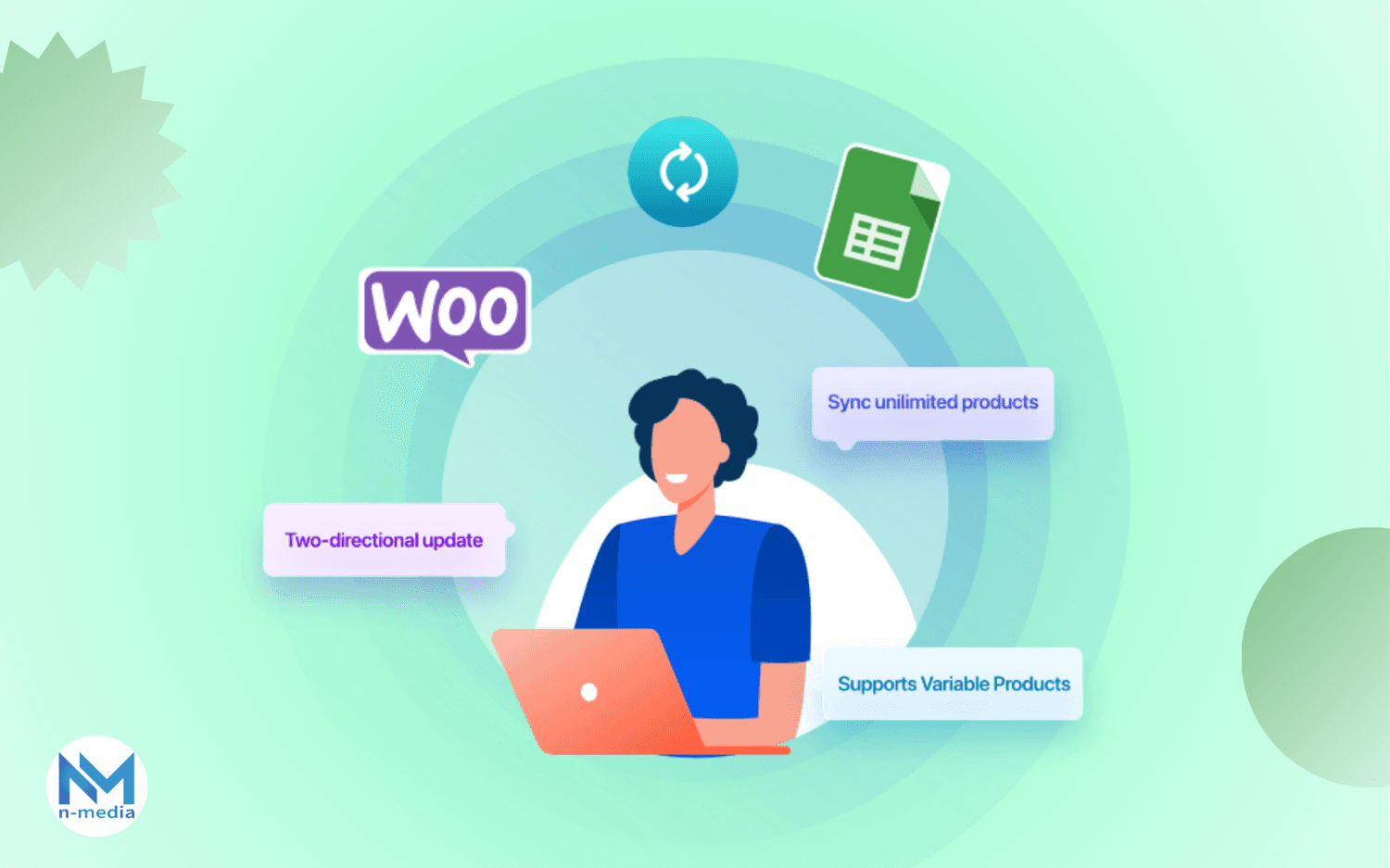
Bulk Edit WooCommerce Products 10X Faster – With Google Sheets!
Tired of slow, manual updates? Effortlessly create & edit products in bulk using Google Sheets—save time, boost efficiency, and scale your store like never before!

OrderConvo - WooCommerce vendor and member conversations
Communicate to your audience against the order that they placed so that if they want to enquire about anything, it’s not hard to know what they're talking about.

WooCommerce Variations Quantities
Convert WooCommerce Variations into Bulk Orders with Quantities Smart way to use WC variations as bulk order. Add quantities against each variation.

GOHero Customize Your WooCommerce Store in Few Clicks
Complete customization for your Woocommerce store. Change labels of buttons of every WooCommerce element like add to cart etc.

WordPress Front End File Manager
This plugin makes file management so easy for your WordPress site. There is so much that you can do. See the tutorial to know about everything.

WP Avatar – A Member Avatar Customization Plugin
With WP Avatar, you can enhance your site by allowing users to create and customize their avatars effortlessly. In just a few steps, provide a personalized touch to your membership site by integrating user-friendly avatar creation and profile customization options.

Revamp Your WordPress Login Experience with WP Simple Login Screens
In a competitive online world, first impressions count, even on your login page. The WP Simple Login Screens plugin lets you easily transform your default WordPress login screen to match your brand’s aesthetic, giving your site a professional look and feel.


Trusted by Global Companies.
10k
World Wide Clients
1M+
Downloads
550
Plugins
Compatible with
Seamlessly integrate with your favorite tools and platforms


Simple & Affordable Pricing
No recurring fees or hidden costs—just a straightforward payment for each plugin. Get full access and updates without the hassle of subscriptions. Enjoy lasting value with a single purchase!

Latest News & Blogs
Lorem ipsum dolor sit amet, consectetur adipiscing elit. In convallis tortor eros. Donec vitae tortor lacus. Phasellus aliquam ante in maximus.